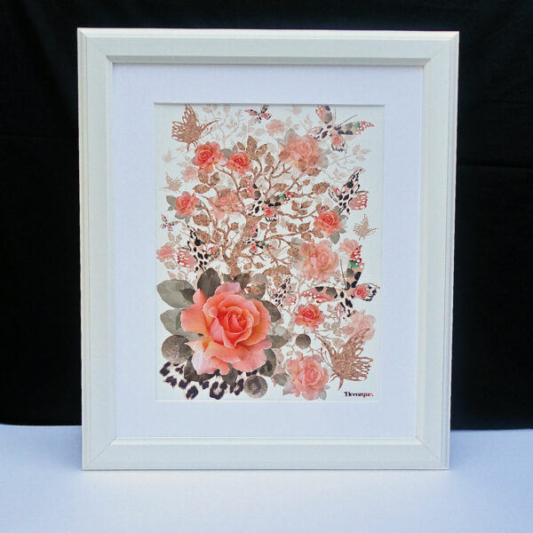
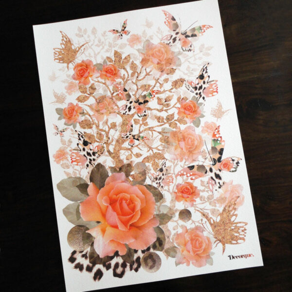
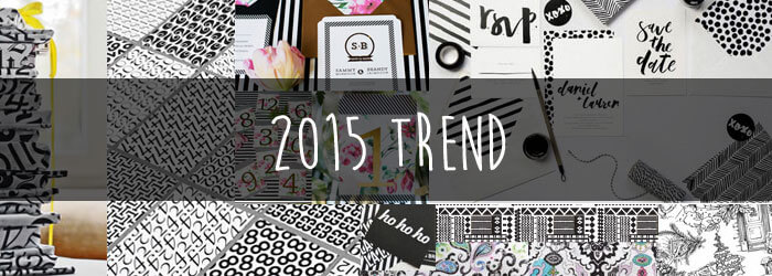
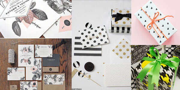
Most of my designs are awash with colour. I very rarely stick to a monochrome palette mainly because the subjects I choose, such as florals and birds require plenty of colour and detail. There is something so timeless and classic about designs in black and white, hence why it is always such a fashion staple as highlighted in this years Harpers Bazaar and on WHSmiths blog in July as gift wrap inspiration for 2015.
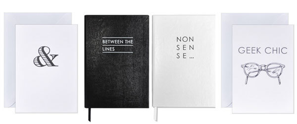
Simple, graphic designs using clean lines and keeping it minimalist just feels so sleek. Stylish typographic stationery such as these cool notepads and cards by Sloane Stationery, ooze class and sophistication while adding a touch of cheeky humour.
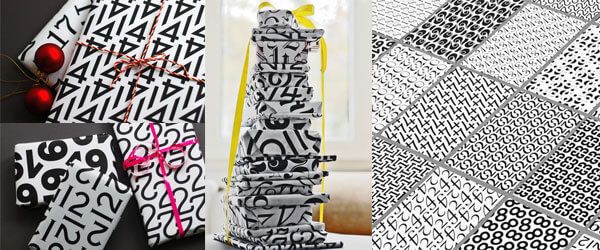
 Really graphic, pattern led design like this gift wrap by Angelo Stitz on Behance allow for some colourful accessories, such as tags and ribbon. They also all compliment each other when wrapped and stacked together. The simplicity of the letters and numbers created an visually interesting pattern, allowing shapes to form due to the layout.
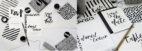
That being said, you can certainly achieve detail with a two-tone palette, it just takes a different approach. It can start to get less graphic, like this wedding stationery collection called Rowney by Emma Jo. All her designs stick to the monochrome theme but as they are hand drawn and painted initially, they feel a bit more artistic and they add personality, which makes them uniquely charming and personal.
From that you can then move onto more detailed monochrome ideas, like florals, patterns and illustrations that move closer into my type of design! You can certainly get some detail into design, like this business stationery using intricate line drawings for Living + Co.

I like it when you mix a bright colour with black and white, as I feel it gives it that pop of colour that it needs as an accent. That can be a neon, a more pastel shade or even a metallic like gold like this Kate Spade stationery or this DIY Valentines wrapping paper on Passion Shake, but I feel it adds an extra layer of interest and visually catches the eye.
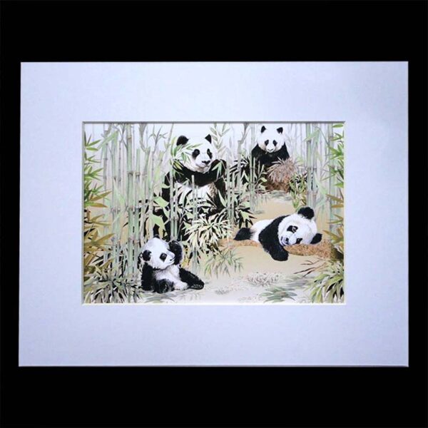
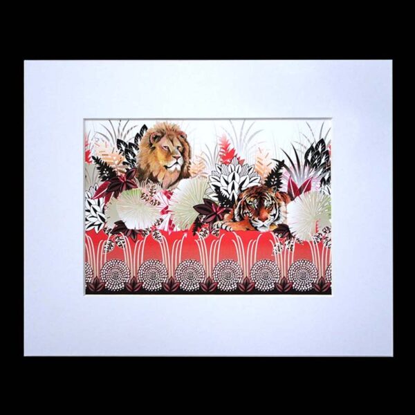
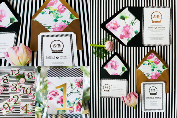
Then you can treat it like I do and mix it with full on florals, like this wedding stationery featured on the Style Me Pretty blog. This is how I have introduced a monochrome palette into my card designs, where I can mix it with more tropical colours and themes. Here is a small selection of monochrome cards on my site for you to take a look at.
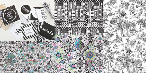
I’ve also been inspired to delve into my archives and find some designs that I could reinvent using some of the ideas I’ve seen here. I like the idea of mixing them with typography, similar to these Christmas card designs by Pixels Plus Paper and transforming them into a new card collection, so August is going to be a busy month!!
For more inspiration take a look at my Monochrome Pinterest board, filled with plenty of black and white design ideas.

